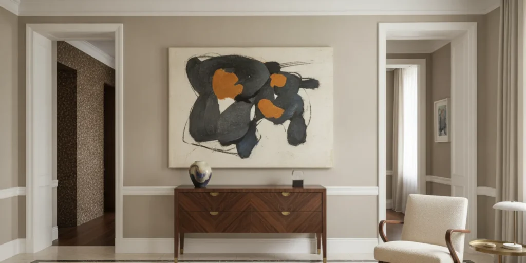
In modern interior design, a painting can do more than introduce color. It can set the atmosphere for a room and help guide decisions about architecture, furnishings, materials, and light. The most successful palette does not copy every hue in the artwork. It gives the work room to speak while creating a home that feels composed, personal, and comfortable to live in.
Discuss your home and collection
How should modern interior design begin with the painting?
Begin with the art, not a paint card. If possible, consider the work in the room where it will live. Look beyond its most vivid color. Notice the softened shade in a shadow, a warm ground beneath a bright mark, or a dark edge that gives the composition weight. These quieter notes can make more graceful connections to an interior than the most saturated color.
Record a few observations before choosing finishes. What mood does the work create: contemplative, animated, intimate, or expansive? Does it have a strong frame or a visually quiet edge? Are its forms delicate or emphatic? Consider scale as well as color. A small work may need a thoughtful relationship to nearby furniture and wall space, while a large canvas can exert a presence across the room.
Then consider the collection as a whole. One painting may lead the design, but other works may bring different colors, sizes, and visual rhythms into the same home. A collection-first approach to interiors for art collectors starts by understanding those relationships, rather than treating art as a final layer after every other decision has been made.
Make a simple working note: the room’s intended use, the painting’s strongest and quietest colors, its visual weight, and the feeling you want the interior to hold. This note is not a rigid brief. It is a way to keep decisions connected when you begin comparing wall finishes, textiles, and furniture.
Which modern interior design palette suits the artwork and the room?
There is no single correct palette. The right direction depends on the work, the architecture, the light, and the life of the room. Compare approaches before committing to a dominant color or finish.
| Palette direction | How it works | Useful when | What to watch |
|---|---|---|---|
| Quiet ground | Use nuanced, lower-contrast colors on large surfaces and allow the art to carry concentrated color. | The work is visually active or the room has several functions. | A flat neutral can feel impersonal; look at undertone and texture. |
| Secondary-tone echo | Repeat one quieter color from the painting in a textile, object, or smaller furnishing. | The room needs a subtle visual bridge to the artwork. | Too many exact matches can make the scheme feel literal. |
| Considered contrast | Place a contrasting color near selected details while preserving visual breathing space. | The painting can hold a lively conversation with its surroundings. | Check the strength and area of the contrast in the whole room. |
| Related tonal range | Build light and dark values within a connected color family. | A composed, enveloping atmosphere suits the architecture and use. | Vary texture and value so the room does not become monotonous. |
Think of these options as starting points, not formulas. A color that seems harmonious on a small sample may become overpowering across a wall or sofa. A restrained accent may be enough to make the relationship clear. In a room with several works, it can be more useful to build around a shared quality, such as warmth, depth, or contrast, than to repeat a separate color from every piece.
The home need not use one palette in every room. A color relationship may begin in a principal space and become quieter in a passage or adjoining room. That kind of continuity can keep the residence connected while allowing each space to respond to its own art, light, and purpose. The broader plan for designing around an art collection helps a single painting belong to a larger composition.
How can you test color in changing light?
Light changes how color is perceived. A wall may appear cooler in morning daylight and warmer under lamps in the evening. A bright window can make one part of a room feel different from a shaded corner. Before settling on paint, fabric, or another finish, view samples in the actual room at several times of day.
Test samples at a generous scale when possible. Small chips help narrow choices, but larger samples reveal undertones and make it easier to judge how a color behaves beside the artwork. Place the sample where the finish will be used and also near the painting. Keep the art in its intended position during the test; a color read beside a frame may look different from the same sample across the room.
Look at the arrangement from the places where people will encounter it: the entrance, a seat, a dining area, or the approach from an adjoining room. A palette is not only a view from directly in front of the canvas. Sightlines and transitions shape the experience too. For more on that relationship, consider how natural light interacts with contemporary art and how the lighting plan can support a collection.
For a delicate or valuable work, avoid assuming that a visually pleasing light level is necessarily appropriate for the object. The Library of Congress notes that light damage is cumulative and that visible light can still harm sensitive materials even after ultraviolet and infrared radiation are reduced (Limiting Light Damage). Ask a qualified conservator when the needs of a particular artwork are uncertain.
What should furnishings and materials contribute?
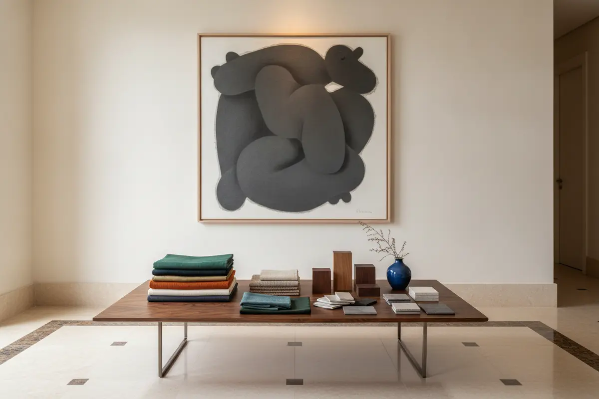
Color is only one part of a successful composition. Materials add depth through sheen, grain, texture, and age. A matte wall, polished stone, patinated metal, or richly grained wood each changes the way a painting feels in its setting. Consider those qualities in relation to the artwork’s surface and frame, rather than selecting every finish independently.
Furniture shapes the encounter as much as the palette does. Its scale and placement should support both looking and daily use. In a living room, seating can allow a clear view while preserving an easy path through the space. A table or cabinet may create a visual bridge through proportion or material without repeating a motif from the painting. Bespoke furnishings can respond to a room’s dimensions and the character of its art; the aim is a coherent relationship, not a literal reproduction of the artwork.
For a layered scheme, decide which element carries the strongest visual emphasis. If the painting is highly active, a quieter textile or a more restrained furniture silhouette may help it remain legible. If the artwork is subtle, a crafted surface or sculptural furnishing may add dimension without competing. The relationship between a frame, nearby wood, metal details, and upholstery can be more persuasive than a precise color match.
When several rooms are being considered, let materials and colors travel selectively. A tone from a painting might appear as a small accent in an adjoining space; a wood finish could create continuity along a route through the home. The interior can feel collected without making every room identical. An example of this attention to proportion and individual character is explored in bespoke furniture design.
How do scale and circulation affect the palette?
A palette cannot be judged apart from the scale of the work and the space around it. A large painting with a forceful composition may need a quieter stretch of wall, or it may call for a deliberately rich setting. A small work can feel isolated on an expansive wall unless furniture, architectural detail, or a related group gives it context. Neither situation has a universal remedy; the surrounding proportions matter.
Consider the distance from which the art is seen. In a long room, the palette may need to connect the first view at the entrance with the closer experience near a seating area. In a more intimate room, a deep or layered color can bring the composition closer, provided it suits the light and the other works. A view from one room into another can also make a color echo feel purposeful.
Circulation is part of the design, not an afterthought. People should be able to move comfortably without furniture interrupting important sightlines or making the painting feel crowded. Think about doors, openings, and the routes between gathering areas. The principles in planning circulation around art are especially useful when an open plan brings several views and functions together.
Scale and proportion also influence which colors feel balanced. A strong hue on a broad surface carries more visual weight than the same hue on a small object. Before increasing the amount of color, consider whether its area, value, or texture should change instead. A considered relationship between scale and proportion can help the artwork remain at ease within the room.
What common choices can make the palette feel forced?
A palette may feel overworked when every color in a painting is repeated around the room. It may feel disconnected when the surrounding choices ignore the artwork and architecture altogether. A few disciplined decisions usually create more ease than a literal match.
- Repeating every color. Choose one or two useful notes and let the remaining colors stay within the artwork.
- Choosing from a photograph alone. Screens and room lighting can change how colors appear. Confirm choices with physical samples in the actual space.
- Ignoring the frame and surface. The frame, canvas, paper, and visible texture all contribute to the work’s relationship with nearby materials.
- Forgetting the room’s use. The palette must support gathering, reading, or other routines as well as looking at art.
- Making every room match. Repetition can create continuity, but a home benefits when each space responds to its art, light, and architecture.
- Adding color to solve every imbalance. Sometimes proportion, placement, material, or lighting, not another accent, is what the composition needs.
When a home holds several works, do not make each room a separate display or let one painting dictate every decision. Consider how the collection unfolds as someone moves through the residence: where one work is first seen, what it answers or contrasts with, and how much visual quiet lies between significant moments. The art can lead without turning the home into a gallery environment detached from daily life.
A lasting scheme tends to feel considered rather than tied to a passing look. That does not mean avoiding expressive choices. It means making them in relation to the collection, craftsmanship, and the way the home is used. CW DESIGN describes its point of view as timeless interior design, with art and material choices understood as part of a larger residential composition.
What sequence helps you choose and refine the palette?
- Understand the setting. Note the room’s architecture, intended uses, natural light, and views from adjoining spaces.
- Read the artwork. Record its dominant and secondary colors, contrast, mood, scale, surface, and frame.
- Look at the collection. Identify relationships among works that may share the room or appear along the same route.
- Choose a direction. Decide whether the room should recede, echo a secondary tone, create contrast, or use a related tonal range.
- Gather a considered sample group. Include wall colors, textiles, wood, stone, and metal where they are relevant. Avoid testing too many unrelated options at once.
- View samples in context. Place them near the work and where the materials will be used. Review morning, afternoon, and evening conditions.
- Check the full composition. Look at the art with furnishings, rugs, architectural details, and circulation paths, not only against a paint card.
- Refine by removing. If a finish competes without improving the relationship, take it out of the scheme before introducing another element.
- Review the home as a whole. Confirm that the palette supports transitions between rooms while allowing each space to retain its own character.
This sequence helps prevent a common mismatch: choosing a wall color from an isolated image, then discovering that the actual artwork, shifting light, and furnishings tell a different story. For a whole apartment or residence, decisions about one room are best understood alongside the others. The design approach considers the art, architecture, and furnishings as connected parts of the interior.
When is an on-site review especially useful?
An on-site review is valuable when the work is large, daylight shifts significantly, the architecture is complex, or several pieces must coexist. Seeing the artwork and rooms together reveals relationships that a description or isolated sample cannot. It also makes it possible to understand placement, proportion, and movement in their actual setting. For specialist lighting considerations, this guide to lighting artwork in a home offers another point of reference.
For an art-led residential project, the palette is one part of a bespoke interior rather than a stand-alone color exercise. CW DESIGN’s work is grounded in an on-site understanding of the home and its collection; that connection among art, architecture, and daily life is essential to making choices that feel personal and enduring. The firm’s residential projects offer examples of interiors considered across varied settings and scales.
When you are ready to discuss a residence and its collection, contact CW DESIGN to begin a conversation about the project and the space.
Start a conversation about your home
Frequently Asked Questions
Should the wall color match the painting?
No. A close match can make a room feel overly literal. A nuanced neutral, a quieter secondary tone, or a deliberate contrast may support the work more naturally. Test the option in the room before deciding.
Can a vivid painting work in a restrained room?
Yes. A quieter background can give a vivid work clarity. Texture, considered furnishings, and carefully placed material accents can keep the room from feeling empty while allowing the artwork to remain distinct.
How many colors from the artwork should appear elsewhere?
There is no fixed number. Often one or two secondary notes are enough to connect the painting to its setting. A collection with several works may call for a broader relationship based on shared warmth, value, or contrast rather than repeated colors.
Should furnishings be chosen before or after the painting?
For a collection-led interior, consider the artwork early. That does not mean every furnishing must follow it literally; it means scale, placement, light, materials, and daily use can be coordinated from the start.
Can one palette continue throughout an entire home?
A home can share a family of tones and materials without repeating one palette in every room. Let each space respond to its art, light, architecture, and use while preserving a quiet sense of continuity.
A well-considered palette allows a painting to remain distinct while giving the home a thoughtful, lasting relationship to the collection.