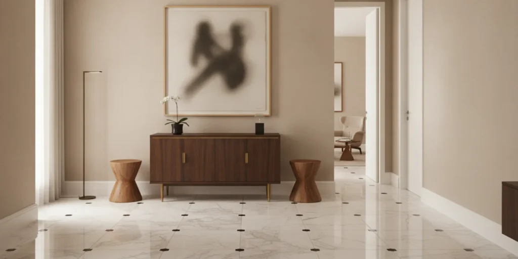
Choosing wall finishes for contemporary art collection settings is not simply a matter of selecting a pleasing color. The surface behind a work affects its visual weight, the way light moves across it, and how clearly its edges and materials register. Texture, reflectance, tone, and continuity all matter. When those decisions are considered alongside the artwork and the architecture, the wall can give a collection presence without competing for attention.
Discuss a collection-led residential project
What does the wall contribute to the experience of a work?
A wall is part of the setting in which a work is seen. Its color can alter the apparent temperature of a painting; its texture can add visual activity; and its sheen can introduce highlights that draw the eye away from the art. These effects are not uniform. A large, quiet monochrome work asks different things of its surroundings than a small, richly layered painting or a sculptural piece with a reflective surface.
Begin by looking at the collection as it will be encountered in the home. Consider the works that should anchor a room, the pieces that will be seen together, and the relationship between art and furniture. A wall treatment that feels right in isolation may become too assertive once a painting, a lamp, and a substantial piece of furniture occupy the same view. This is one reason an art-first approach treats the collection as a starting point rather than a finishing touch.
For a wider view of how the collection informs a residence, see CW DESIGN’s design approach and its discussion of interior design for art collectors.
How should you assess texture before choosing a finish?
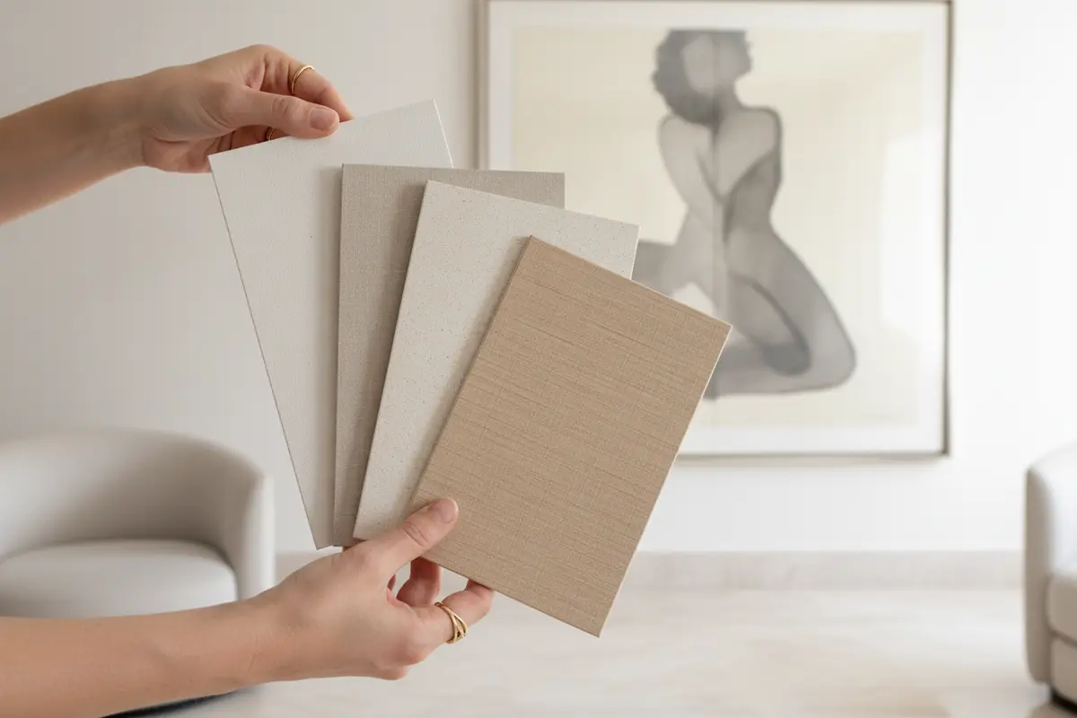
Texture creates a second layer of visual information. A smooth painted surface tends to recede; a pronounced plaster, grasscloth, or other tactile finish can make the wall itself an active presence. Neither is inherently better. The question is whether the surface supports the kind of attention the artwork deserves and suits the broader character of the home.
Look closely at the work’s own surface. A painting with a delicate, finely worked surface may benefit from a calm background that does not introduce a competing pattern. A more graphic or materially assertive work may sit comfortably against a subtle tactile finish, provided the wall’s texture does not obscure its form from a normal viewing distance. For sculpture, think about how shadows fall around the object and whether a strong wall texture creates unnecessary visual noise.
- Quiet surface: Consider when the work has fine detail, a complex composition, or a strong color presence that should remain the focus.
- Subtle texture: Explore when the room needs depth but the artwork should still read clearly from across the space.
- Pronounced texture or pattern: Use only after reviewing the specific works, their placement, and the full room composition together.
Request generous physical samples rather than relying on a small chip or a screen image. Place them where the artwork is expected to hang, then observe them from the doorway and from the usual seating positions. A sample may appear restrained up close but become a strong visual field across a large wall. Review the sample next to the frame, if there is one, and near adjacent materials such as woodwork and upholstery. The guide to wood walls offers a related perspective on how a wall material can become part of a room’s composition.
What role does reflectance play?
Reflectance describes how much light a surface returns and how that return appears. A high-sheen wall can catch windows, lamps, and moving reflections. That may create liveliness, but it can also compete with a work or make the wall feel visually unsettled. A lower-sheen surface generally creates a quieter field, though the exact effect depends on the material, the light, and the room’s orientation.
Do not decide on sheen from a label alone. View a sample in the actual room at more than one time of day and under the lighting that will be used in the evening. Look for reflections that cross the expected art position. Observe whether a nearby window produces a bright patch, or whether a lamp creates a distracting sheen when someone enters the room. Assess the artwork itself, too: glass, varnish, polished frames, and glossy surfaces can already introduce reflections.
When a home has historic surfaces or details, the finish also belongs to a preservation conversation. The National Park Service’s Preservation Brief 28 on painting historic interiors distinguishes among paint finishes, including special high-gloss treatments. The practical lesson is to specify the finish as carefully as the color and to account for the character of the existing interior.
Wall finish and artwork lighting should be considered together, but they are distinct decisions. For a separate discussion of illumination, see how to light artwork in a luxury home. Here, keep attention on the wall’s own response to light and on whether that response supports the collection.
How can tone support the art without dictating the room?
Tone is more than choosing a color family. Compare a wall sample with the work’s dominant and secondary colors, its frame, and the architectural elements around it. A wall that is too close in value to the artwork may flatten its silhouette. A strong contrast can sharpen the outline, but it may also make the painting feel isolated or turn the wall into a dramatic backdrop. The right relationship depends on the specific work and the surrounding composition.
Instead of beginning with a trend or a favorite paint name, identify the quality of light and the atmosphere the rooms should hold. Is the desired setting calm and enveloping, or does the collection benefit from a crisp contrast? Does the work include warm earth tones, cool passages, or a broad range of hues? Consider how the chosen tone relates to neighboring rooms and to the furniture, textiles, and architectural details that remain in view.
Test a short list of substantial samples rather than comparing many tiny swatches. Place each sample in the intended location and beside the art or a faithful color reference. Assess it against the wall’s full height and width, because surrounding surfaces influence perception. A tone that appears balanced on a small card can feel quite different when expanded across a long wall. For a broader view of how an art collection can inform a home’s palette and composition, explore designing around an art collection.
Why does continuity matter across a whole home?
Continuity does not require every room to have the same finish. It means the transitions feel intentional and the collection remains in conversation with the architecture. A sequence of rooms may move between quiet painted surfaces and more tactile treatments, for example, while a consistent sense of proportion and restraint holds the experience together. The goal is not to make every wall disappear; it is to avoid abrupt decisions that distract from the home as a whole.
Map the principal views through the residence. Identify which artworks are visible from a hall, entry, or adjacent room, and note where the eye travels. Then ask whether a change in sheen, color, or texture supports that sequence. A dramatic finish may be compelling in a contained setting but distracting if it interrupts the sightline to an important work elsewhere. Considering the home as a complete composition can also make the wall decisions more durable as furniture and art placements evolve.
This whole-home perspective is particularly useful in a substantial renovation, when walls, architectural details, and art placement are being considered together. See the renovation management overview for context on coordinated residential work, and browse CW DESIGN projects for examples of work across different settings. The Tribeca loft and Brooklyn townhouse pages offer further views of distinct residential contexts.
Which finish should you consider for the room?
The table below is a discussion framework, not a universal specification. Actual results depend on the product, the existing substrate, natural and artificial light, the artwork, and the standards appropriate to the property. Review samples on site before settling the choice.
| Finish direction | Visual character | Questions to test with the art |
|---|---|---|
| Smooth, low-sheen paint | Quiet and visually restrained | Does the work need a calm field? Are there distracting reflections at likely viewing angles? |
| Soft, subtle texture | Adds depth while keeping pattern understated | Does the texture remain secondary to the work from across the room? |
| Pronounced texture or patterned wallcovering | Strong tactile or graphic presence | Does it support the collection, or compete with the work’s surface, frame, and composition? |
| Higher-sheen treatment | More reflective and visually active | Do windows or lamps create glare, and does the wall’s character suit the architecture? |
What should you review before approving a wall finish?
Before a finish is finalized, review it in context rather than as an isolated material selection. Bring together the art or accurate references, frame finishes, adjoining materials, and samples of the proposed wall treatment. Where the collection is extensive, start with the works that will anchor the most important rooms and sightlines. Then check how the choices relate to secondary works and the larger rhythm of the home.
Also consider the physical character of the room. A narrow passage, a generous gallery-like wall, and a room with deep architectural detail each create a different relationship between surface and artwork. Note where door casings, built-ins, or a change in wall plane will interrupt a finish. If a piece is likely to move, consider whether the treatment will remain harmonious when the wall is viewed without it. This is not a reason to avoid character; it is a way to make sure the room still feels composed when the collection changes.
Think about how the wall will be lived with, too. A finish may need to sit near a busy entry or a seating area where people pass close to the surface. Ask how it should be maintained and whether touch-ups would be visible against the texture or sheen. For a home with historic details or carefully restored furnishings, consider whether a proposed finish feels at ease beside those materials rather than appearing newly imposed. These practical questions belong in the design conversation alongside color and display, because a beautiful sample is only one part of how the room will work over time.
- Confirm the art context. Note the work’s scale, surface, frame, visual weight, and intended position. Include nearby works that will be seen at the same time.
- Compare physical samples. Review texture, color, and sheen at full scale where possible. Observe each sample both close up and from the room’s normal viewing positions.
- Check multiple lighting conditions. Revisit the samples in daylight and with the evening lighting in use. Watch for reflections and changes in apparent tone.
- Assess architectural continuity. Look at doorways, trim, ceiling lines, and neighboring rooms. Confirm that transitions feel considered rather than accidental.
- Make a coordinated decision. Consider the wall as one element in a composition that includes art, furniture, objects, and light, not as a backdrop selected independently.
For an art-led residence, these judgments are most useful when grounded in the actual space. Catherine Weinstock’s multidisciplinary background includes interior design, furniture restoration, and fine arts, and her practice begins with understanding the place and the collection. To learn more about her background, visit the CW DESIGN about page.
Start a conversation about your residence
Frequently Asked Questions
Should every artwork have a different wall finish?
Not necessarily. A home can use a restrained, coherent palette of finishes while allowing individual works to stand out through placement, scale, and carefully considered contrast. The collection and the architecture together should guide whether a particular room calls for a distinct treatment.
Is a matte wall always best for contemporary art?
No single sheen is right for every work or room. Lower-sheen surfaces often read as quieter, while more reflective finishes can introduce liveliness and highlight the wall itself. Review samples under the room’s actual light and consider both the artwork’s surface and expected viewing angles.
How can I tell whether a textured wall is too distracting?
Look at the sample with the artwork from normal viewing distances, not only close up. If the texture becomes the first thing you notice, obscures fine detail, or creates a restless field around the work, a more subdued surface may better support the composition.
When should wall finishes be decided during a renovation?
Consider them while the broader plan for the rooms, art placement, and lighting is being developed. Early coordination helps avoid treating the wall as a last-minute backdrop and allows finish choices to respond to the collection and the architecture together.
The most considered wall finish is the one that gives the collection room to be seen while belonging naturally to the home around it.